Several tools are available for investigating the quality of your sequencing data and these should be used before any downstream analysis, after all, crap in carp out.
The first tool, written in Java and called fastqc, has a simple GUI or can be used in the command line to generate a number of useful graphs describing several important features of your sequence data. These include (among others) per base quality and read length distributions, as well as detection of sequence duplication’s and kmer content. Handily the authors also provide some good and bad Illumina data that you can use to test out the software.
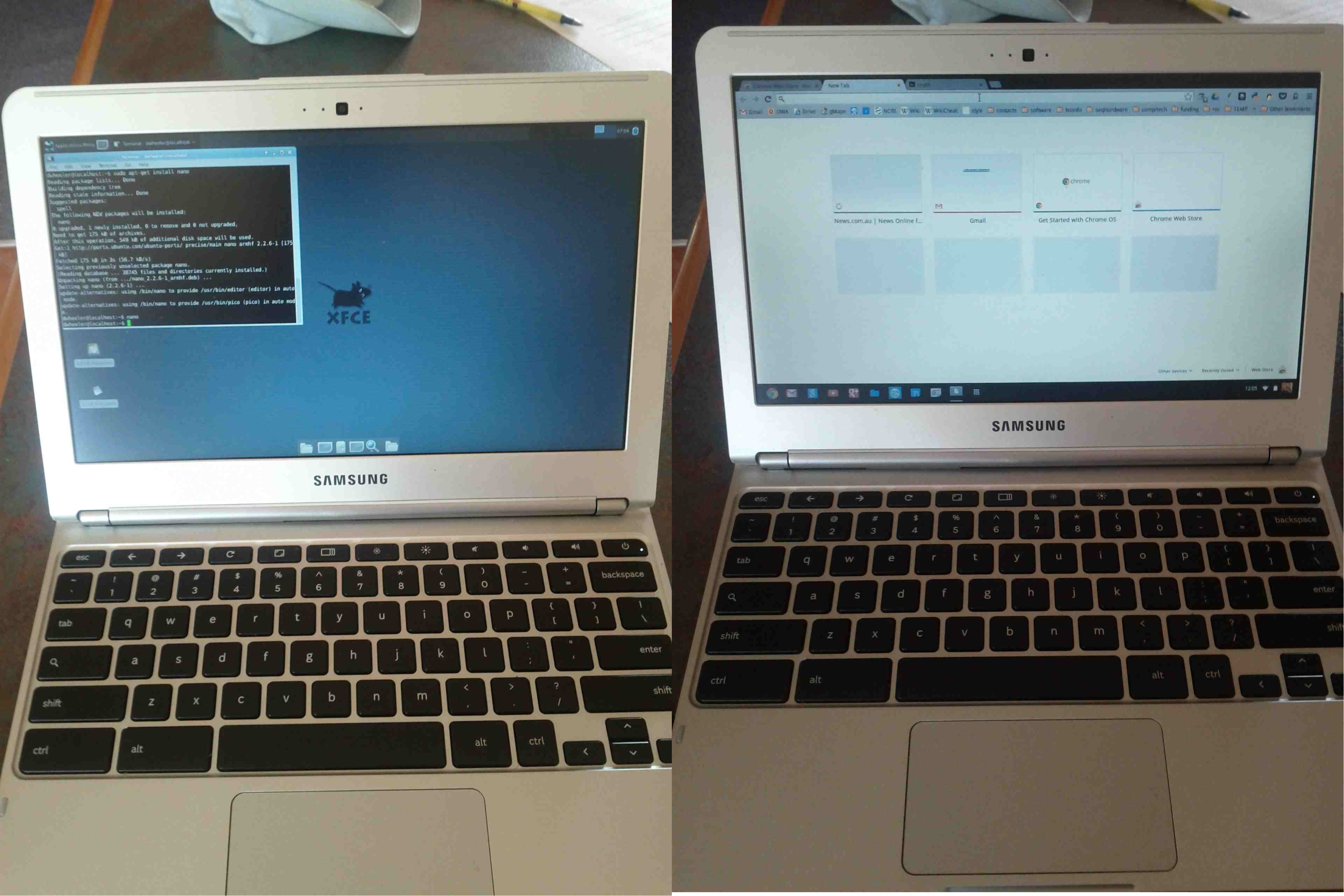
Running is easy, either use the GUI or just type: ./fastqc seq_file_name
The –help flag will provide the other options, format detection is automatic and worked for me so probably the only option you might consider is ‘-t’ to set the number of cores to use.

As you can see by the html report that is produced by fastqc a summary is provided indicating if your data meet a certain quality expectations (these seem to be very strict).
Here I have run the good (left) and bad (right) test data-sets and shown them side by side for comparison. Edit: These data-sets come from the SolexaQA package that I’ll talk about in another blog.

These box whisker plots of quality per base show how illumina data degrades at the 3′ end of the read. Here the median value as red line, box (yellow) the inter-quantile range (35-75%), upper/lower whiskers represent 10% and 90% points, while the blue line is the mean quality. Good quality scores (green), reasonable (orange), and (poor) are indicated by background shading. A warning will be issued if any base is less than 10, or if the median for any base is less than 25.
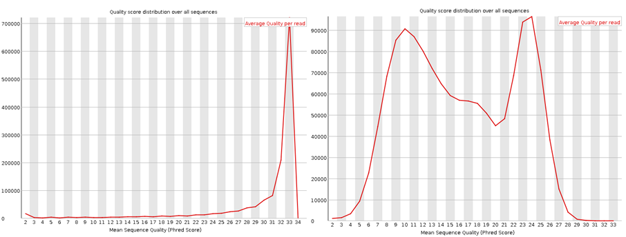
These plots show the quality score distribution over all sequences. The fastQC manual says that even in good data a small proportion of sequences may have low quality scores, often because they were poorly imaged.
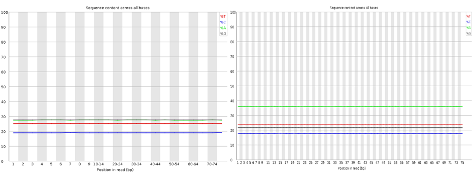
Nothing dramatic here, these are the sequence content of each nucleotide across the reads, the lines should be horizontal reflecting the underlying GC%.
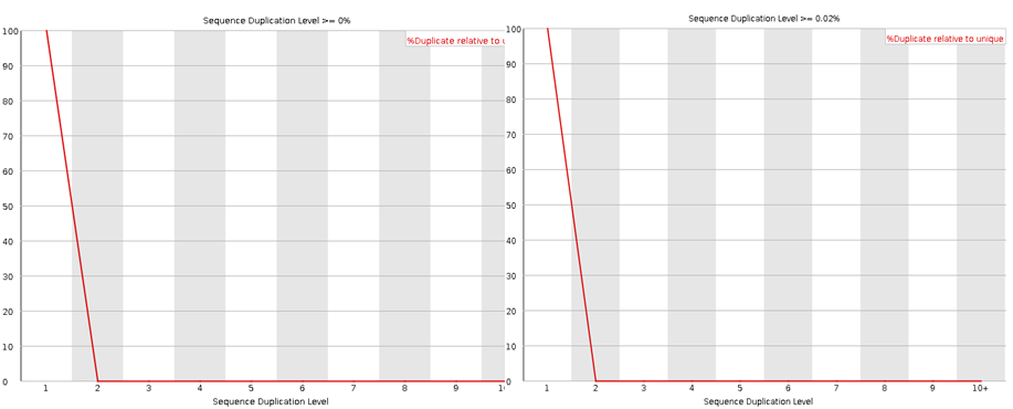
The sequence duplication level will reveal any problems during library preparation. Note that any duplicates that occur greater than 10 times are lumped into the 10+ category so if you see a pile-up there you have problems. Note that some duplication may occur if their is very high coverage.

The per base N content should be less than 3%.

The GC content distribution of the data (red) against a theoretical modeled distribution (blue). A shifted GC distribution away from the modeled normal distribution indicates a systematic bias that is independent of base position, probably the result of contamination in the library or some kind of bias subset of sequences.

The line should be horizontal in a random library, GC bias which changes in different bases can indicate over-represented sequence in your library.
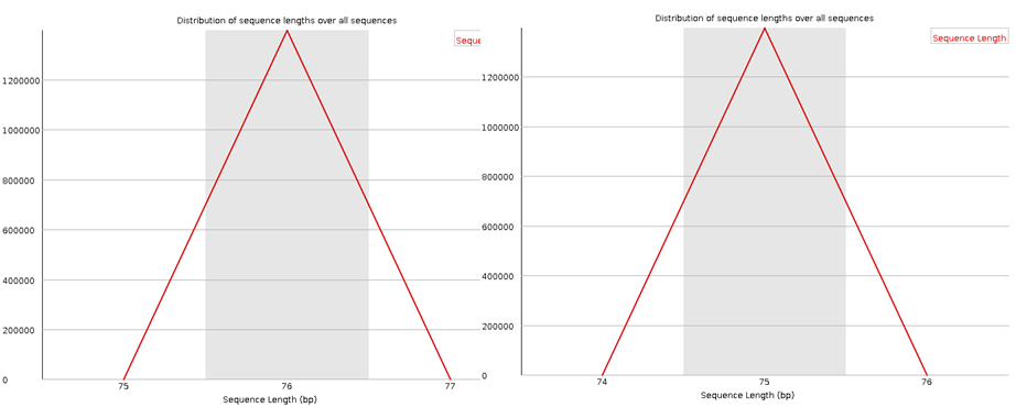
In most cases the sequence length distribution should be uninteresting (at least for illumina data), but if any kind of trimming has occurred this should be revealed here.