As an Aussie I cop a little bit of flack living in New Zealand. It helps that since I’m from the South of Australia I follow Aussie Rules footy, not this rugby shenanigans, so I don’t bother too much with the constant focus on how much better the All Blacks are relative to our poor Wallabies (Australia has won as many world cups as New Zealand – Take that!).

Kiwi’s have bloody good gum boots; they have to do more than keep the mud off! – inside joke (-;
That said as a bit of fun I thought I would do a post on the Pandas python module using data from StatsNZ. It has too be about sheep right! The actual spreadsheet I downloaded from StatsNZ and used in this is here.
I’ll be using pandas, ipython, and matplotlib to create some graphs to show the decline of sheep in NZ. In the next post I’ll try and work out why (yes I know you could find this out in 3 seconds with google, but thats no fun).
First we will read the file using pandas and make a dataframe. Pandas can import in all kinds of file formats, with excel you need to include a sheet name (that little tab at the bottom of the excel sheet).
#imports
import pandas as pd
import matplotlib.pyplot as plt
#sheetname required for xlsx
data_file = pd.read_excel('livestock1.xlsx',sheetname='livestock')

#make a dataframe
data = pd.DataFrame(data_file)
data.head()
Out[8]:
                                                 1994          2002      2003  \
Total beef cattle                             5047848       4491281   4626617
Calves born alive to beef heifers/cows        1262522       1083485   1079334
Total dairy cattle                            3839184       5161589   5101603
Calves born alive to dairy heifers/cows       2455975       3225238   3115897
Total sheep                              4.946605e+07  3.957184e+07  39552113
-----
                                             2010      2011      2012
Total beef cattle                         3948520   3846414   3734412
Calves born alive to beef heifers/cows     901258    901375    827749
Total dairy cattle                        5915452   6174503   6445681
Calves born alive to dairy heifers/cows   3640914   3884257   3879543
Total sheep                              32562612  31132329  31262715
So we made a dataframe, the head method acts like bash head in that it shows the start of the frame rather than the whole thing. Currently the years are columns and the stock type are rows, lets flip the table, which is super easy!
 #we really want the dates as the index
data = data.T
data.head()
-------
     Total beef cattle Calves born alive to beef heifers/cows  \
1994           5047848                                1262522
2002           4491281                                1083485
2003           4626617                                1079334
2004           4447400                                1013893
2005           4423626                                1018730
Now that we have the years as rows, actually an index, it will be much easier to do our plotting. But the column names are overly informative, as in long, lets shorten them.
#the column names are pretty long, lets fix that now
data.columns
Out[13]: Index([u'Total beef cattle', u'Calves born alive to beef heifers/cows', u'Total dairy cattle', u'Calves born alive to dairy heifers/cows', u'Total sheep', u'Total lambs marked and/or tailed', u'Total deer', u'Fawns weaned', u'Total pigs', u'Piglets weaned', u'Total horses'], dtype=object)
sub_data = data.loc[:,['Total beef cattle','Total dairy cattle','Total sheep','Total deer',
'Total pigs','Total horses']]
sub_data = sub_data.replace('..',0)#replace .. with 0
sub_data = sub_data.astype('float')
sub_data.head()
Out[17]:
      Total beef cattle  Total dairy cattle  Total sheep  Total deer  \
1994            5047848             3839184     49466054     1231109
2002            4491281             5161589     39571837     1647938
2003            4626617             5101603     39552113     1689444
2004            4447400             5152492     39271137     1756888
2005            4423626             5087176     39879668     1705084
2006            4439136             5169557     40081594     1586918
2007            4393617             5260850     38460477     1396023
2008            4136872             5578440     34087864     1223324
2009            4100718             5860776     32383589     1145858
2010            3948520             5915452     32562612     1122695
2011            3846414             6174503     31132329     1088533
2012            3734412             6445681     31262715     1060694
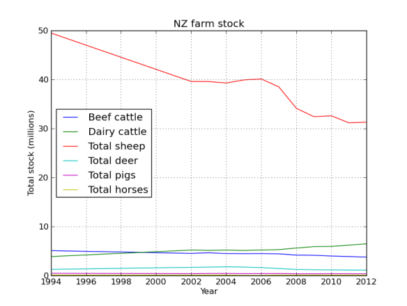
Great! Now to make the plot easier to look at lets divide the dataframe by 1 million.
#now divide by a million
sub_data = sub_data.divide(1000000)
#first plot everything
sub_data.plot(legend=True)
plt.xlabel('Year')
plt.ylabel('Total stock (millions)')
plt.title('NZ farm stock')
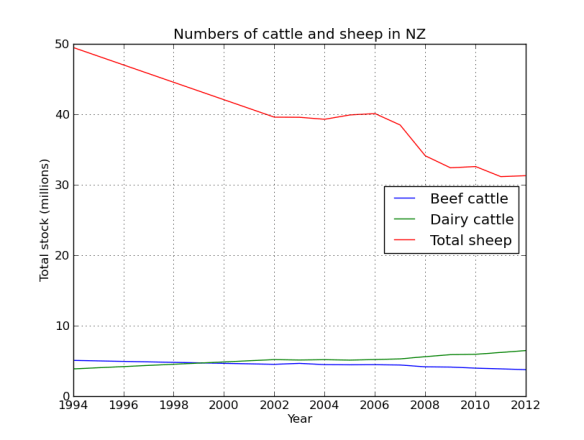
Yes that is correct, back in the 90’s there were 50 million sheep in NZ, not bad for a country with a population of ~3 million people. Baa. But their numbers have been in serious decline since then, replaced by their bigger brothers the cows.
Lets face it, NZ is all cows and sheep, lets just look at that data.
#lets just plot cows and sheep, that being the first 3 columns
cow_sheep = sub_data.ix[:,[0,1,2]]
cow_sheep.plot(label=True,title="Numbers of cattle and sheep in NZ")
plt.xlabel('Year')
plt.ylabel('Total stock (millions)')
 The data has meat cows and milk cows as separate columns, its easy to combine them.
#a milk cow and meat cow are still cattle
cow_sheep['Total cows'] = cow_sheep.ix[:,0] +  cow_sheep.ix[:,1]
cow_sheep.ix[:,2:].plot(legend=True,title="Total cattle and sheep in NZ")
plt.xlabel('Year')
plt.ylabel('Total stock (millions)')
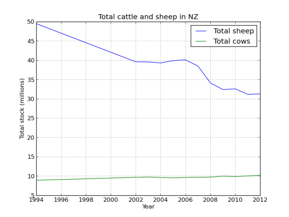 So the country is cowafying, mostly dairy replacing beef cattle. Although the increase looks slight, basically its 25% up! That’s a lot of grass, cow shit, and methane!
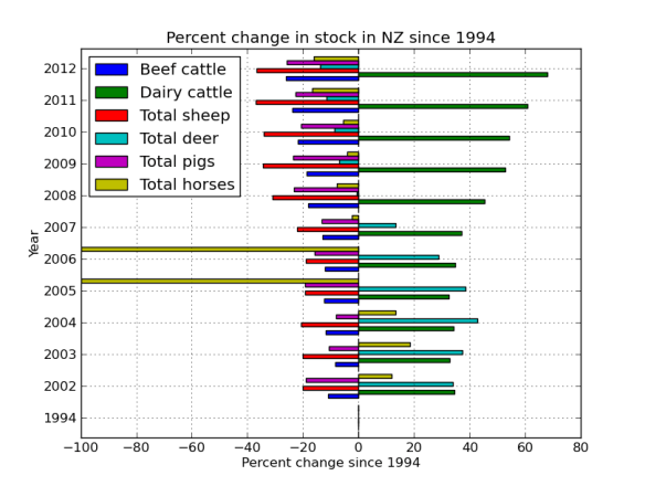
Now lets look at the change in the numbers of each stock since 1994 (the start of our data). We do this by passing all the data as well as all the data minus 1994 to a function that handles the calculation. Pandas handles this all in the back end and parses the data in the frame through the function, nice.
def percent(dataframe,d1):
    '''calculate percent change relative to first column (1994)'''
    a = 100*((dataframe.ix[0,:]-d1)/dataframe.ix[0,:])
    return 0-a

#pass the entire data frame to this function
percent_data = percent(sub_data,sub_data.ix[0:,:])

percent_data.head()
Out[38]:
      Total beef cattle  Total dairy cattle  Total sheep  Total deer  \
1994           0.000000            0.000000     0.000000    0.000000
2002         -11.025827           34.444950   -20.002034   33.858009
2003          -8.344764           32.882482   -20.041908   37.229441
2004         -11.895128           34.207998   -20.609926   42.707754
2005         -12.366101           32.506699   -19.379727   38.499840

      Total pigs  Total horses
1994    0.000000      0.000000
2002  -19.100637     11.811093
2003  -10.766476     18.504488
2004   -8.072078     13.376472
2005  -19.230733   -100.000000
#the years are plotted as floats, its easy to convert them!
percent_data.index=percent_data.index.astype(int)
#figure 4
percent_data.index=percent_data.index.astype(int)
percent_data.plot(kind='barh')
plt.title('Percent change in stock in NZ since 1994')
plt.xlabel('Percent change since 1994')
plt.ylabel('Year')
 I really want the graph the other way around, so lets re-index. Also, lets get rid of the nags, they look funny because the frame was missing some data. More proof that Far Lap was an Australian horse.
horseless = sub_data.ix[:,:-1]
horseless_per = percent(horseless,horseless.ix[0:,:])
#flip the axis
horseless_per = horseless_per.reindex( index=data.index[ ::-1 ] )
horseless_per.index=horseless_per.index.astype(int)
horseless_per.plot(kind='barh')
plt.title('Percent change in stock in NZ since 1994')
plt.xlabel('Percent change since 1994')
plt.ylabel('Year')
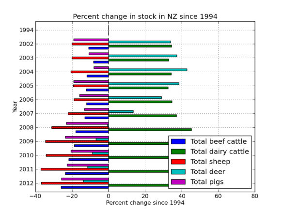
Finally, its silly having the 1994 data as its zero, but it was a nice sanity check to make sure the % function was working correctly. But lets get rid of it now by just plotting part of the frame.
horseless_per[:-1].plot(kind='barh')
plt.title('Percent change in stock in NZ since 1994')
plt.xlabel('Percent change since 1994')
plt.ylabel('Year')
The ‘barh’ is just bar graph horizontal.
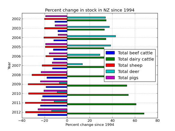 So it looks like there was a venison craze in the early 00’s, but mostly just more and more dairy.
#save the file
horseless_per.to_csv('stock_num_diff_average.csv')
Ok, so although there are still a LOT of sheep in NZ, it really is the country of the cow now. What might be driving that? Lets look at some commodity prices in the next post!


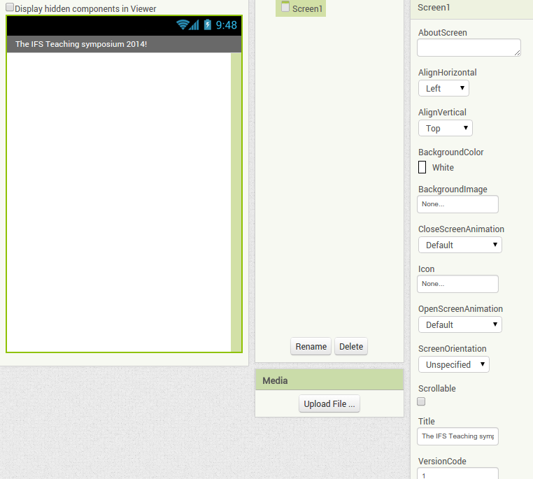


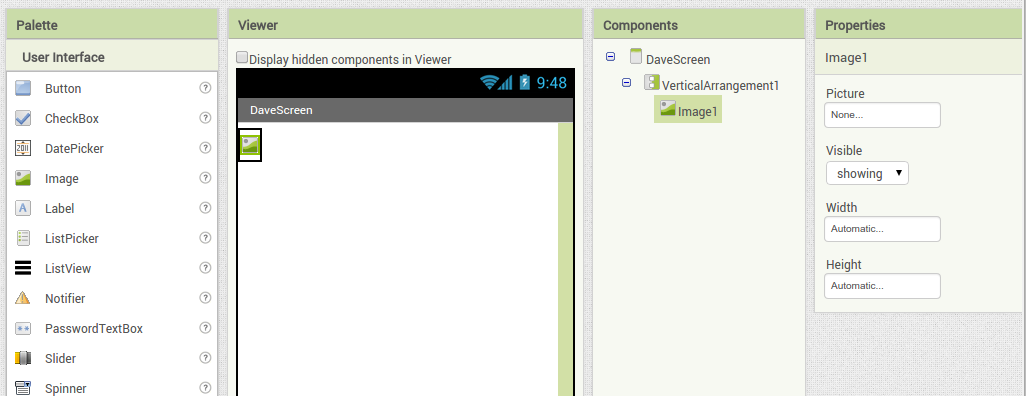
 Back in the designer we can populate this new screen with a photo and some text, using a vertical alignment is simple just drag it onto the window and specify its attributes in the right hand panel.
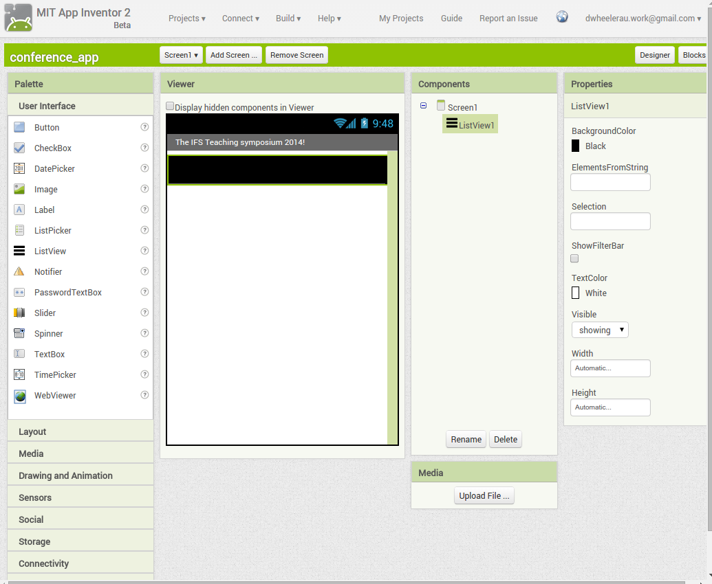
 Now Drag an image icon onto the panel and then by clicking on “image1” in the components plane we can upload an image and resize it using the properties. You really can’t get much easier than that really, can you!