I’ve been playing around a little with the stats-centric programming language R, mostly to get a better handle on the Bioconductor differential gene expression analysis packages edgeR and DEseq. The language is designed to allow for easy manipulation of tabular data as well as providing access to a rich library of statistical packages and graphing tools. One thing I learned was that often it was more efficient (at least for me) to spend a little time pre-formatting the data using python/perl before even getting started with R. The charting features of R are pretty cool, but once again I missed my familiar Python environment)-:
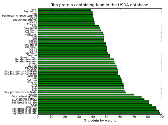
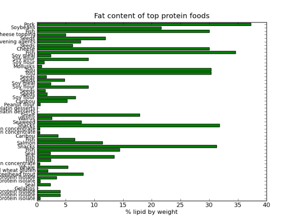
But, as always there is a Pythonic way, I came across a great book called Python for Data Analysis by Wes McKinney. The book introduced me to the pandas library, which contains R-like tools for tabular data manipulations and analyses. The book also introduced the Ipython development environment; basically a souped up feature rich but light weight “python IDLE”. The best features of Ipython for me are the logging capabilities, advanced history and de-bugging utilities – very cool! Ipython has been designed to work well with the matplotlib, thus allowing production and manipulation of nice looking graphs and charts within an interactive python environment. I’m still very much learning this (and I’m a hack programmer), but here is some fun data crunching based on a USDA food database wrangled into into Json format by Ashley Williams.
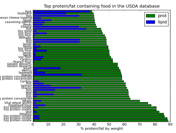
Ok, I think it would look better on one chart. Here is the top 50 protein containing foods with their fat content as part of one graph.
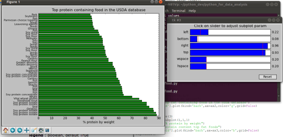
Note that I chopped the y-axis labels off, doh, no problem just modify them in real time using the slider editor!
Not too bad at all for a newbee. Hopefully by next post I will feel a little more comfortable to share some hard learned lessons on data manipulation using pandas.


