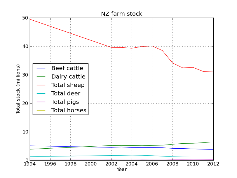
Ok, based on the graphs in the last post NZ is slowly being cow-a-fyed, so whats driving this trend. Well google will tell you that its …
WARNING: This data is dodgy, but I’m really just using it to demonstrate how cool pandas is. So I found some information on milk and lamb meet prices, we’ll load them up as dataframes and work out the percent change since 1994 like we did before. We’ll try out the datetime functionality of pandas, which is really quite nice. But first just to import our table from the last post and make the year the index so we can easily merge the new data.
import pandas as pd
per_decline = pd.DataFrame(pd.read_csv('percent_decline.csv'))
cols = per_decline.columns.values
cols[0] = 'Year'
per_decline.columns = cols
per_decline.index = per_decline['Year']
per_decline = per_decline.ix[:,1:] #all rows, skip first column (date is now the index)
per_decline.head()
	Total beef cattle	Total dairy cattle	Total sheep	Total deer	Total pigs	Total horses
Year
1994	 0.000000	 0.000000	 0.000000	 0.000000	 0.000000	 0.000000
2002	-11.025827	 34.444950	-20.002034	 33.858009	-19.100637	 11.811093
2003	 -8.344764	 32.882482	-20.041908	 37.229441	-10.766476	 18.504488
2004	-11.895128	 34.207998	-20.609926	 42.707754	 -8.072078	 13.376472
2005	-12.366101	 32.506699	-19.379727	 38.499840	-19.230733	-100.000000
Now we are going to create a table from the dodgy lamb price data, this table is in a slightly different format so we will have to use the groupby method to wrangle it into the shape we need.
lamb_data = pd.DataFrame(pd.read_excel('lamb_usd.xlsx',sheetname='lamb'))
lamb_data.head()
	Month	Price	Change
0	 Apr 1994	 130.00	 -
1	 May 1994	 126.59	 -2.62 %
2	 Jun 1994	 127.03	 0.35 %
3	 Jul 1994	 126.11	 -0.72 %
4	 Aug 1994	 119.62	 -5.15 %
Now to use datetime to make an index based on the month data.
lamb_data.index = pd.to_datetime(lamb_data['Month'])
lamb_data=lamb_data.ix[:,1:2] #just grab the price
lamb_data.head()
	Price
Month
1994-04-02	 130.00
1994-05-02	 126.59
1994-06-02	 127.03
1994-07-02	 126.11
1994-08-02	 119.62
Pandas did a good job of converting the date format into a datetime index. As you’ll see in a second this datetime object has some extra functionality that makes dealing with dates a breeze. Although this new data has the date and price information we need, its divided into quarterly amounts. As you can see by the commented out code, initially I made a mistake and summed these values, but really we want the mean to get the average yearly price. I left the mistake code there as it shows how easy it would have been to get the sum using groupby.
#wrong! lamb_prices = lamb_data.groupby(lamb_data.index.year)['Price'].sum()
lamb_prices = lamb_data.groupby(lamb_data.index.year)['Price'].mean()
lamb_prices = pd.DataFrame(lamb_prices[:-1]) #get rid of 2014
lamb_prices.head()
	Price
1994	 124.010000
1995	 113.242500
1996	 145.461667
1997	 150.282500
1998	 116.013333
We pass the year index to groupby and get it to do its magic on the price column (our only column in this case, but you get the idea), we then just call the mean method to return the mean price per year. The datetime object made specifying the year easy. Now we are going to write a quick function to calculate the percent change since 1994.
def percent(start,data):
    '''calculate percent change relative to first column (1994), better than previous attempt )-:'''
    ans = 100*((start - data)/start)
    return 0-ans

lamb_change = percent(lamb_prices.Price[1994],lamb_prices)
lamb_change.head()
	Price
1994	 0.000000
1995	 -8.682768
1996	 17.298336
1997	 21.185791
1998	 -6.448405
Great! Now just add that column to our original dataframe. Notice how only the intersect of the dates are used, very handy (ie it drops 1995-2001 from the lamb price data as these dates are not in our stock number table)!
per_decline['Lambprice'] = lamb_change
per_decline.head()
	Total beef cattle	Total dairy cattle	Total sheep	Total deer	Total pigs	Total horses	Lambprice
Year
1994	 0.000000	 0.000000	 0.000000	 0.000000	 0.000000	 0.000000	 0.000000
2002	-11.025827	 34.444950	-20.002034	 33.858009	-19.100637	 11.811093	 17.768056
2003	 -8.344764	 32.882482	-20.041908	 37.229441	-10.766476	 18.504488	 28.869984
per_decline.index=per_decline.index.astype(int) #lamb2
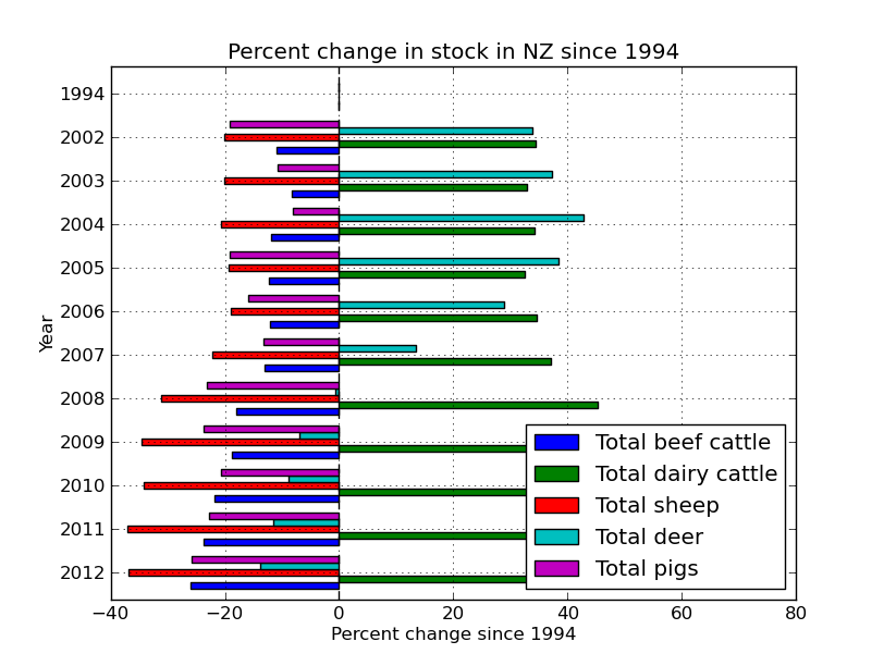
per_decline.plot(kind='barh')
plt.title('Percent change in stock in NZ since 1994')
plt.xlabel('Percent change since 1994')
plt.ylabel('Year')

The next series of code and graphs adds in milk and lamb prices to try and see why farmers are moving from ovines to bovines!
milk_data = pd.DataFrame(pd.read_excel('milk_prices_usd.xlsx',sheetname='milk'))
milk_data.index=milk_data['year']
milk_data.head()
	year	thousand head	pounds	mill lbs	price_cwt
year
1989	 1989	 10046	 14323	 143893	 13.56
1990	 1990	 9993	 14782	 147721	 13.68
1991	 1991	 9826	 15031	 147697	 12.24
1992	 1992	 9688	 15570	 150847	 13.09
1993	 1993	 9581	 15722	 150636	 12.80
#get rid of the info we don't need
milk_data = pd.DataFrame(milk_data.ix[5:,:])
milk_change = percent(milk_data.price_cwt[1994],milk_data)
per_decline['milk_price'] = milk_change
per_decline.head()
	Total beef cattle	Total dairy cattle	Total sheep	Total deer	Total pigs	Total horses	Lambprice	milk_price
Year
1994	 0.000000	 0.000000	 0.000000	 0.000000	 0.000000	 0.000000	 0.000000	 0.000000
2002	-11.025827	 34.444950	-20.002034	 33.858009	-19.100637	 11.811093	 17.768056	 -6.630686
2003	 -8.344764	 32.882482	-20.041908	 37.229441	-10.766476	 18.504488	 28.869984	 -3.469545
2004	-11.895128	 34.207998	-20.609926	 42.707754	 -8.072078	 13.376472	 33.670672	 23.747109
2005	-12.366101	 32.506699	-19.379727	 38.499840	-19.230733	-100.000000	 29.762385	 16.653816
per_decline.plot(kind='barh')
 These graphs are a little busy, lets just concentrate on the important stuff.
<pre>animals=['Total dairy cattle','Total sheep','Lambprice','milk_price']
interesting_data=per_decline[animals]
interesting_data.plot(kind='barh')

interesting_data.plot()
Finally!