SAM / BAM files explained?

Featured

Lets face it there aren’t too many HTS pipelines that don’t touch a SAM/BAM files somewhere along the way. The name SAM comes from the acronym Sequence Alignment/Map format and they are really nothing more than tab delineated text files describing mapping information for short read data. Of course with the millions of reads generated by next gen sequencers these days the files become really really big. That is where BAM files come in, these contain the same information as SAM files but are encoded in condensed computer readable binary format to save disk space.

If you open up a SAM file in a text editor (or use “head” in bash) the first part of the file typically contains lines beginning with AT (@) symbol, which represents the “header”. The header contains general information about the alignment, such as the reference name, reference length, MD5 checksum, the program used for the alignment, etc etc. Every line after the header represents a single read, with 11 mandatory tab separated fields of information. Lets see how this works with a really simple example.

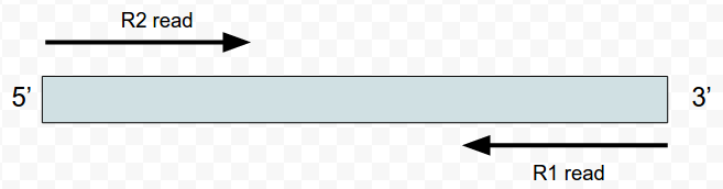
What I’ve done is mapped four ‘pairs’ of reads to the alcohol dehydrogenase gene (my favourite gene) using bowtie2. The figures below shows the stranded nature of the read pairs as well as where they map on the gene.

Screenshot - 281115 - 11:07:01

I have set this up so that the reads fall into these three groupings.

  1. Two pairs of high quality reads that concordantly map
  2. A read pair where only one read is high quality
  3. An orphan read (the R1 read is only 1 nt long aka trimming)

The next figure describes each of the mapping scenario’s using the colour encoding. The red set of reads behave as we would expect for paired end data.

Where the reads map and the different read scenario

Where the reads map and the different read scenarios

For the alignment I’m going to use bowtie2, all of the sequences are here if you want to do this yourself.

#index the reference and specify the prefix as reference
bowtie2-build reference.fa reference

#map the reads
bowtie2 reference -1 test_R1.fq -2 test_R2.fq > adh.sam

####bowtie output###
Warning: skipping mate #1 of read 'HWI-7001326F:39:C7N3UANXX:1:1101:10000:62296/1' because length (1) <= # seed mismatches (0)
Warning: skipping mate #1 of read 'HWI-7001326F:39:C7N3UANXX:1:1101:10000:62296/1' because it was < 2 characters long 4 reads; of these: 4 (100.00%) were paired; of these: 1 (25.00%) aligned concordantly 0 times 3 (75.00%) aligned concordantly exactly 1 time 0 (0.00%) aligned concordantly >1 times
    ----
    1 pairs aligned concordantly 0 times; of these:
      0 (0.00%) aligned discordantly 1 time
    ----
    1 pairs aligned 0 times concordantly or discordantly; of these:
      2 mates make up the pairs; of these:
        1 (50.00%) aligned 0 times
        1 (50.00%) aligned exactly 1 time
        0 (0.00%) aligned >1 times
87.50% overall alignment rate

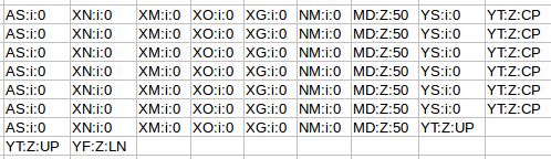
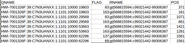
The “adh.sam” file can be opened with any text editor, but for most of this post I’m going to use the spreadsheet version just to easily work with all the columns. Note the header lines indicated with the “@”. In this case the @SQ relates to the reference and @PG relates to the program parameters. Each header line has fields in the format tag:value. For example, the @SQ line has SN (SN=reference sequence name) and LN (LN=reference sequence length). A full set of these header can be found in the SAM specs.

 
@HD	VN:1.0	SO:unsorted
@SQ	SN:gi|568815594:c99321442-99306387	LN:1890
@PG	ID:bowtie2	PN:bowtie2	VN:2.1.0

Below the header each read is represented by a line, it is worth nothing that even read “62296/1” which shouldn’t map since it is only 1 nt long also gets a line. Two other things to note are that firstly the reads can be ordered by reference coordinate, this is the default Tophat behaviour. Alternatively, they can be listed in pairs. Samtools can be used to switch between formats using the “sort” command and why does this matter? Some software needs to know how the reads are sorted, for example htseq-count expects reads ordered in pairs because read pairs can map different distances away from each other and finding them in the file increases memory requirements.

OK the fist four column. The QNAME (seq name) and RNAME (reference name) are pretty self explanatory. The FLAG uses information dense bit-wise encoding containing information on the alignment, such as the strand, if the pair mapped, if this if the first or second pair. If your dumb like me you’ll be thankful for the Broads has a nifty website that translates these numbers into plain English. For example, the 83 represents “read paired”, “read mapped in proper pair”, “read reverse strand”, “first in pair”. The 163 is “read paired”, “read mapped in proper pair”, “mate reverse strand” and “second in pair”. I think that makes sense. For reference the other two numbers are 137 (read paired, mate unmapped) and 69 indicating an unmapped read pair. Very cool. The final flag here POS corresponds to the alignment coordinates. We can confirm the reads are ordered R1 then R2 based on the mapping coordinates (see the figure at the top of the page).


col1

The next flags worth looking at are the MAPQ and CIGAR strings. The mapping quality is represented as a log transformed probability of mapping to the wrong position. Interestingly, the low quality (fastq quality “$”) has the same mapping score as the other high quality reads. I gather this is because the read really can only go one place when there is a 100% match and the reference is only short like this. The CIGAR string starts with a letter, in this case “M” for “alignment match” and 50 indicating the length of the alignment. The “*” indicates that no information is available. PNEXT is the position of the mate pair and TLEN is the observed template length, in other words the length of the sequenced fragment represented by the pairs.

col2

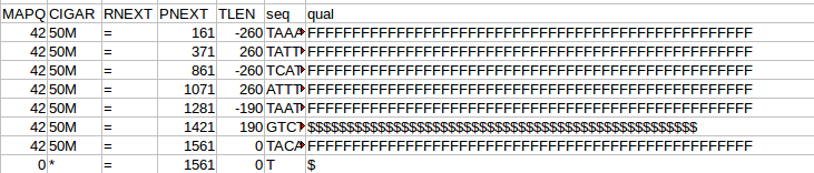
Finally, we have sets of tags that provide other information on the alignment. Things like the number of ambiguous bases or gaps etc. Checkout the documentation of your aligner to find out what each tag defines if you are interested.

col3


Advertisement

New Zealanders and their sheep – part 2

Ok, based on the graphs in the last post NZ is slowly being cow-a-fyed, so whats driving this trend. Well google will tell you that its …

WARNING: This data is dodgy, but I’m really just using it to demonstrate how cool pandas is. So I found some information on milk and lamb meet prices, we’ll load them up as dataframes and work out the percent change since 1994 like we did before. We’ll try out the datetime functionality of pandas, which is really quite nice. But first just to import our table from the last post and make the year the index so we can easily merge the new data.

import pandas as pd
per_decline = pd.DataFrame(pd.read_csv('percent_decline.csv'))
cols = per_decline.columns.values
cols[0] = 'Year'
per_decline.columns = cols
per_decline.index = per_decline['Year']
per_decline = per_decline.ix[:,1:] #all rows, skip first column (date is now the index)
per_decline.head()

	Total beef cattle	Total dairy cattle	Total sheep	Total deer	Total pigs	Total horses
Year						
1994	 0.000000	 0.000000	 0.000000	 0.000000	 0.000000	 0.000000
2002	-11.025827	 34.444950	-20.002034	 33.858009	-19.100637	 11.811093
2003	 -8.344764	 32.882482	-20.041908	 37.229441	-10.766476	 18.504488
2004	-11.895128	 34.207998	-20.609926	 42.707754	 -8.072078	 13.376472
2005	-12.366101	 32.506699	-19.379727	 38.499840	-19.230733	-100.000000

Now we are going to create a table from the dodgy lamb price data, this table is in a slightly different format so we will have to use the groupby method to wrangle it into the shape we need.

lamb_data = pd.DataFrame(pd.read_excel('lamb_usd.xlsx',sheetname='lamb'))
lamb_data.head()
	Month	Price	Change
0	 Apr 1994	 130.00	 -
1	 May 1994	 126.59	 -2.62 %
2	 Jun 1994	 127.03	 0.35 %
3	 Jul 1994	 126.11	 -0.72 %
4	 Aug 1994	 119.62	 -5.15 %

Now to use datetime to make an index based on the month data.

lamb_data.index = pd.to_datetime(lamb_data['Month'])
lamb_data=lamb_data.ix[:,1:2] #just grab the price
lamb_data.head()
	Price
Month	
1994-04-02	 130.00
1994-05-02	 126.59
1994-06-02	 127.03
1994-07-02	 126.11
1994-08-02	 119.62

Pandas did a good job of converting the date format into a datetime index. As you’ll see in a second this datetime object has some extra functionality that makes dealing with dates a breeze. Although this new data has the date and price information we need, its divided into quarterly amounts. As you can see by the commented out code, initially I made a mistake and summed these values, but really we want the mean to get the average yearly price. I left the mistake code there as it shows how easy it would have been to get the sum using groupby.

#wrong! lamb_prices = lamb_data.groupby(lamb_data.index.year)['Price'].sum()
lamb_prices = lamb_data.groupby(lamb_data.index.year)['Price'].mean()
lamb_prices = pd.DataFrame(lamb_prices[:-1]) #get rid of 2014
lamb_prices.head()
	Price
1994	 124.010000
1995	 113.242500
1996	 145.461667
1997	 150.282500
1998	 116.013333

We pass the year index to groupby and get it to do its magic on the price column (our only column in this case, but you get the idea), we then just call the mean method to return the mean price per year. The datetime object made specifying the year easy. Now we are going to write a quick function to calculate the percent change since 1994.

def percent(start,data):
    '''calculate percent change relative to first column (1994), better than previous attempt )-:'''
    ans = 100*((start - data)/start)
    return 0-ans

lamb_change = percent(lamb_prices.Price[1994],lamb_prices)
lamb_change.head()
	Price
1994	 0.000000
1995	 -8.682768
1996	 17.298336
1997	 21.185791
1998	 -6.448405

Great! Now just add that column to our original dataframe. Notice how only the intersect of the dates are used, very handy (ie it drops 1995-2001 from the lamb price data as these dates are not in our stock number table)!

per_decline['Lambprice'] = lamb_change
per_decline.head()
	Total beef cattle	Total dairy cattle	Total sheep	Total deer	Total pigs	Total horses	Lambprice
Year							
1994	 0.000000	 0.000000	 0.000000	 0.000000	 0.000000	 0.000000	 0.000000
2002	-11.025827	 34.444950	-20.002034	 33.858009	-19.100637	 11.811093	 17.768056
2003	 -8.344764	 32.882482	-20.041908	 37.229441	-10.766476	 18.504488	 28.869984
per_decline.index=per_decline.index.astype(int) #lamb2
per_decline.plot(kind='barh')
plt.title('Percent change in stock in NZ since 1994')
plt.xlabel('Percent change since 1994')
plt.ylabel('Year')

fig_9


The next series of code and graphs adds in milk and lamb prices to try and see why farmers are moving from ovines to bovines!

milk_data = pd.DataFrame(pd.read_excel('milk_prices_usd.xlsx',sheetname='milk'))
milk_data.index=milk_data['year']
milk_data.head()
	year	thousand head	pounds	mill lbs	price_cwt
year					
1989	 1989	 10046	 14323	 143893	 13.56
1990	 1990	 9993	 14782	 147721	 13.68
1991	 1991	 9826	 15031	 147697	 12.24
1992	 1992	 9688	 15570	 150847	 13.09
1993	 1993	 9581	 15722	 150636	 12.80
#get rid of the info we don't need
milk_data = pd.DataFrame(milk_data.ix[5:,:])
milk_change = percent(milk_data.price_cwt[1994],milk_data)
per_decline['milk_price'] = milk_change
per_decline.head()
	Total beef cattle	Total dairy cattle	Total sheep	Total deer	Total pigs	Total horses	Lambprice	milk_price
Year								
1994	 0.000000	 0.000000	 0.000000	 0.000000	 0.000000	 0.000000	 0.000000	 0.000000
2002	-11.025827	 34.444950	-20.002034	 33.858009	-19.100637	 11.811093	 17.768056	 -6.630686
2003	 -8.344764	 32.882482	-20.041908	 37.229441	-10.766476	 18.504488	 28.869984	 -3.469545
2004	-11.895128	 34.207998	-20.609926	 42.707754	 -8.072078	 13.376472	 33.670672	 23.747109
2005	-12.366101	 32.506699	-19.379727	 38.499840	-19.230733	-100.000000	 29.762385	 16.653816
per_decline.plot(kind='barh')

lamb_3 These graphs are a little busy, lets just concentrate on the important stuff.

<pre>animals=['Total dairy cattle','Total sheep','Lambprice','milk_price']
interesting_data=per_decline[animals]
interesting_data.plot(kind='barh')

lamb_4

interesting_data.plot()

Finally!

lamb_5

Pandas data analysis – New Zealanders and their sheep!

Featured

As an Aussie I cop a little bit of flack living in New Zealand. It helps that since I’m from the South of Australia I follow Aussie Rules footy, not this rugby shenanigans, so I don’t bother too much with the constant focus on how much better the All Blacks are relative to our poor Wallabies (Australia has won as many world cups as New Zealand – Take that!).

They make bloody good gum boots (multi-purpose - inside joke (-; )

Kiwi’s have bloody good gum boots; they have to do more than keep the mud off! – inside joke (-;

That said as a bit of fun I thought I would do a post on the Pandas python module using data from StatsNZ. It has too be about sheep right! The actual spreadsheet I downloaded from StatsNZ and used in this is here.

I’ll be using pandas, ipython, and matplotlib to create some graphs to show the decline of sheep in NZ. In the next post I’ll try and work out why (yes I know you could find this out in 3 seconds with google, but thats no fun).

First we will read the file using pandas and make a dataframe. Pandas can import in all kinds of file formats, with excel you need to include a sheet name (that little tab at the bottom of the excel sheet).

#imports
import pandas as pd
import matplotlib.pyplot as plt
#sheetname required for xlsx
data_file = pd.read_excel('livestock1.xlsx',sheetname='livestock')

#make a dataframe
data = pd.DataFrame(data_file)
data.head()
Out[8]:
                                                 1994          2002      2003  \
Total beef cattle                             5047848       4491281   4626617
Calves born alive to beef heifers/cows        1262522       1083485   1079334
Total dairy cattle                            3839184       5161589   5101603
Calves born alive to dairy heifers/cows       2455975       3225238   3115897
Total sheep                              4.946605e+07  3.957184e+07  39552113
-----
                                             2010      2011      2012
Total beef cattle                         3948520   3846414   3734412
Calves born alive to beef heifers/cows     901258    901375    827749
Total dairy cattle                        5915452   6174503   6445681
Calves born alive to dairy heifers/cows   3640914   3884257   3879543
Total sheep                              32562612  31132329  31262715

So we made a dataframe, the head method acts like bash head in that it shows the start of the frame rather than the whole thing. Currently the years are columns and the stock type are rows, lets flip the table, which is super easy!

 #we really want the dates as the index
data = data.T
data.head()
-------
     Total beef cattle Calves born alive to beef heifers/cows  \
1994           5047848                                1262522
2002           4491281                                1083485
2003           4626617                                1079334
2004           4447400                                1013893
2005           4423626                                1018730

Now that we have the years as rows, actually an index, it will be much easier to do our plotting. But the column names are overly informative, as in long, lets shorten them.

#the column names are pretty long, lets fix that now
data.columns
Out[13]: Index([u'Total beef cattle', u'Calves born alive to beef heifers/cows', u'Total dairy cattle', u'Calves born alive to dairy heifers/cows', u'Total sheep', u'Total lambs marked and/or tailed', u'Total deer', u'Fawns weaned', u'Total pigs', u'Piglets weaned', u'Total horses'], dtype=object)
sub_data = data.loc[:,['Total beef cattle','Total dairy cattle','Total sheep','Total deer',
'Total pigs','Total horses']]
sub_data = sub_data.replace('..',0)#replace .. with 0
sub_data = sub_data.astype('float')
sub_data.head()
Out[17]:
      Total beef cattle  Total dairy cattle  Total sheep  Total deer  \
1994            5047848             3839184     49466054     1231109
2002            4491281             5161589     39571837     1647938
2003            4626617             5101603     39552113     1689444
2004            4447400             5152492     39271137     1756888
2005            4423626             5087176     39879668     1705084
2006            4439136             5169557     40081594     1586918
2007            4393617             5260850     38460477     1396023
2008            4136872             5578440     34087864     1223324
2009            4100718             5860776     32383589     1145858
2010            3948520             5915452     32562612     1122695
2011            3846414             6174503     31132329     1088533
2012            3734412             6445681     31262715     1060694

Great! Now to make the plot easier to look at lets divide the dataframe by 1 million.

#now divide by a million
sub_data = sub_data.divide(1000000)
#first plot everything
sub_data.plot(legend=True)
plt.xlabel('Year')
plt.ylabel('Total stock (millions)')
plt.title('NZ farm stock')

Yes that is correct, back in the 90’s there were 50 million sheep in NZ, not bad for a country with a population of ~3 million people. Baa. But their numbers have been in serious decline since then, replaced by their bigger brothers the cows.
Poor sheepies!

Lets face it, NZ is all cows and sheep, lets just look at that data.

#lets just plot cows and sheep, that being the first 3 columns
cow_sheep = sub_data.ix[:,[0,1,2]]
cow_sheep.plot(label=True,title="Numbers of cattle and sheep in NZ")
plt.xlabel('Year')
plt.ylabel('Total stock (millions)')

fig2The data has meat cows and milk cows as separate columns, its easy to combine them.

#a milk cow and meat cow are still cattle
cow_sheep['Total cows'] = cow_sheep.ix[:,0] +  cow_sheep.ix[:,1]
cow_sheep.ix[:,2:].plot(legend=True,title="Total cattle and sheep in NZ")
plt.xlabel('Year')
plt.ylabel('Total stock (millions)')

fig_3So the country is cowafying, mostly dairy replacing beef cattle. Although the increase looks slight, basically its 25% up! That’s a lot of grass, cow shit, and methane!

Now lets look at the change in the numbers of each stock since 1994 (the start of our data). We do this by passing all the data as well as all the data minus 1994 to a function that handles the calculation. Pandas handles this all in the back end and parses the data in the frame through the function, nice.

def percent(dataframe,d1):
    '''calculate percent change relative to first column (1994)'''
    a = 100*((dataframe.ix[0,:]-d1)/dataframe.ix[0,:])
    return 0-a

#pass the entire data frame to this function
percent_data = percent(sub_data,sub_data.ix[0:,:])

percent_data.head()
Out[38]: 
      Total beef cattle  Total dairy cattle  Total sheep  Total deer  \
1994           0.000000            0.000000     0.000000    0.000000   
2002         -11.025827           34.444950   -20.002034   33.858009   
2003          -8.344764           32.882482   -20.041908   37.229441   
2004         -11.895128           34.207998   -20.609926   42.707754   
2005         -12.366101           32.506699   -19.379727   38.499840   

      Total pigs  Total horses  
1994    0.000000      0.000000  
2002  -19.100637     11.811093  
2003  -10.766476     18.504488  
2004   -8.072078     13.376472  
2005  -19.230733   -100.000000  
#the years are plotted as floats, its easy to convert them!
percent_data.index=percent_data.index.astype(int)
#figure 4
percent_data.index=percent_data.index.astype(int)
percent_data.plot(kind='barh')
plt.title('Percent change in stock in NZ since 1994')
plt.xlabel('Percent change since 1994')
plt.ylabel('Year')

fig_4I really want the graph the other way around, so lets re-index. Also, lets get rid of the nags, they look funny because the frame was missing some data. More proof that Far Lap was an Australian horse.

horseless = sub_data.ix[:,:-1]
horseless_per = percent(horseless,horseless.ix[0:,:])
#flip the axis
horseless_per = horseless_per.reindex( index=data.index[ ::-1 ] )
horseless_per.index=horseless_per.index.astype(int)
horseless_per.plot(kind='barh')
plt.title('Percent change in stock in NZ since 1994')
plt.xlabel('Percent change since 1994')
plt.ylabel('Year')

fig_8

Finally, its silly having the 1994 data as its zero, but it was a nice sanity check to make sure the % function was working correctly. But lets get rid of it now by just plotting part of the frame.

horseless_per[:-1].plot(kind='barh')
plt.title('Percent change in stock in NZ since 1994')
plt.xlabel('Percent change since 1994')
plt.ylabel('Year')

The ‘barh’ is just bar graph horizontal.
fig_9So it looks like there was a venison craze in the early 00’s, but mostly just more and more dairy.

#save the file
horseless_per.to_csv('stock_num_diff_average.csv')

Ok, so although there are still a LOT of sheep in NZ, it really is the country of the cow now. What might be driving that? Lets look at some commodity prices in the next post!